0.5
Ultra Light
極白・反光白
The palest anchor range, suited to extremely fair or reflective white-leaning complexion references.
Learn how to read foundation depth, hue bias, and undertone logic using the Color Logic system.
Lightness labels are approximate. Color Logic numbers are the main reference. This guide describes foundation depth, not undertone, transparency, or tanning level.
極白・反光白
The palest anchor range, suited to extremely fair or reflective white-leaning complexion references.
淺
A light anchor range for fair complexion references with visible softness and low depth.
淺
A light anchor range with slightly more depth while still reading clearly fair.
淺中
A light-medium anchor range between fair and medium complexion references.
中
A balanced medium anchor range with moderate visible depth.
中
A medium anchor range with a fuller depth than the central medium reference.
中深
A medium-deep anchor range for complexion references moving from medium into deep.
深
A deep anchor range with strong visible depth and richness.
深
The deepest anchor range in the guide, used for the richest complexion references.
Which direction does the shade lean?
Color Logic does not rely primarily on the conventional Warm / Cool / Neutral system.
Brand undertone terminology varies widely, so Color Logic preserves each brand's original Official Undertone separately while using Hue Bias as a visual, cross-brand way to compare shades.
Hue Bias describes the main visible colour direction of a foundation shade when compared with shades at a similar depth.
Color Logic Hue Bias is a cross-brand visual classification. It is not the same as a brand's Official Undertone.
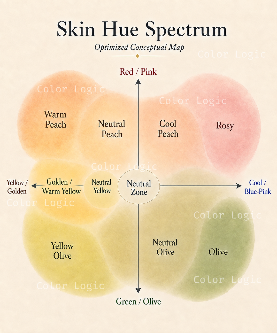
Green / grey-green is most visible.
Yellow or golden leads, with olive underneath.
Olive is present, but neither yellow nor green strongly dominates.
A clearer yellow direction without an olive classification.
Neutral first, with a noticeable yellow lean.
No strong hue direction dominates.
Brand undertone descriptions and visible colour do not always tell the same story.
Hue Bias tells you the main direction. A Modifier adds a secondary visual characteristic when it is useful.
Softened, beige-like colour with lower saturation.
A visibly greyed or desaturated quality.
More pink/red than neighbouring shades within the same Hue Bias.
Most shades do not need a Modifier.